Meeting Room Space Requirements: The Complete Planning Guide

A meeting starts with a familiar compromise. Six people take seats around a table intended for four, one chair catches the wall whenever someone stands, and the person nearest the display becomes an accidental presenter because everyone else has to twist to see the screen. After twenty minutes, the room feels smaller than it looked during the booking process.
That experience usually isn't caused by poor furniture alone. Meeting room space requirements depend on occupancy, chair clearance, technology, accessibility, acoustics, and the way people use the room between the first greeting and the final action item. A room can fit the advertised number of people and still fail as a meeting environment.
Why Your Meeting Room Feels Wrong
A room can look adequate on a floor plan and fail within minutes of the first meeting. Someone needs to leave, three people stand, and a participant walking to the whiteboard blocks the camera. The door opens into a chair, or the display sits behind the person leading the discussion. A headcount will not reveal any of these failures.
Planning around bodies alone creates the wrong model. Attendees bring laptops, chargers, notebooks, coffee, coats, and mobility devices. They also need to enter, leave, turn, and adjust their position without interrupting the discussion. Hybrid meetings add a technology footprint: remote participants need a clear camera view, usable audio, and a display positioned so in-person attendees can face both the screen and one another.
The room can technically fit, but still fail
Small conference rooms often carry a stated capacity that works only when everyone remains perfectly still. The table fits. The chairs fit. A quick visual inspection passes. Then someone pulls out a chair and removes the walkway behind it.
Table footprint and usable room footprint aren't the same thing. The usable footprint includes the space behind occupied chairs, paths to the door and equipment, and room for someone using a wheelchair to approach and turn. Planning guidance commonly recommends 36 to 48 inches of circulation space behind chairs and around tables, especially where people need to pass, reach equipment, or approach a seat with a wheelchair. See conference room sizing guidance from Cubicle by Design.
Practical rule: If one person cannot pull out a chair while another walks behind it, the room is not comfortable at its stated capacity.
Larger rooms fail in different ways. A boardroom may accommodate a long table but leave no workable position for a display wall, camera, service path, or accessible approach. A workshop room may fit rows of chairs yet provide no place for participants to gather around materials. The floor area exists, but the intended meeting mode does not.
Freeform House's actual room layouts make the trade-off visible. A room planned for presentation needs sightlines and camera positions. A room used for collaboration needs open movement around the table or writing surface. Treating both layouts as interchangeable produces a capacity number that hides how the room will operate.
Start with behavior, not decoration
Evaluate how the room is used before choosing furniture or finishes. Review attendance patterns, including typical and occasional group sizes, then check whether people write on walls, move between activities, or join remotely. Utilization data also matters: a room booked for ten people may regularly host four, while a smaller room may be overloaded during certain time periods.
Use five questions:
Occupancy: Who usually attends, and who occasionally attends?
Movement: Can people reach seats, doors, displays, and writing surfaces without crossing the conversation?
Equipment: Where do cameras, microphones, screens, power, and cables live?
Access: Can people with different mobility needs enter, turn, sit, and participate?
Use pattern: Is the room for focused discussion, presentation, workshop activity, or content production?
The room feels wrong when its geometry contradicts its purpose. Aesthetic upgrades will not fix a table that blocks the camera, and a flexible room still fails if nobody can move through it.
The Core Space Formula Per Person and Per Chair
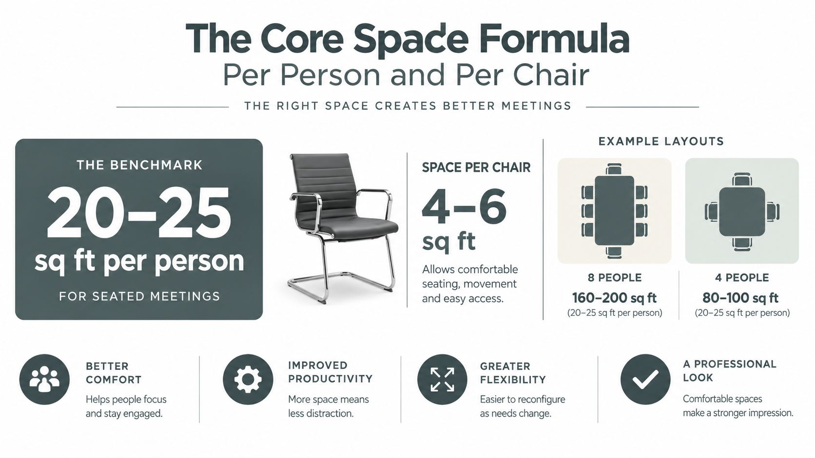
A room can meet its stated capacity and still fail during a real meeting. The number of seats is only one part of the calculation. Area per person sets the room's working footprint, while clearance around each chair determines whether people can sit, stand, reach equipment, and leave without disrupting the conversation.
For a seated meeting, a commonly used planning benchmark is 20 to 25 square feet per person. It includes seating, the table, circulation, and equipment clearance, rather than treating each attendee as a fixed point on a floor plan. The benchmark and related room examples are outlined in this conference room size planning reference.
A compact room for 4 to 6 people commonly falls around 100 to 150 square feet. A medium room for 8 to 12 people often needs about 150 to 300 square feet. A ten-person room may be planned at roughly 200 to 250 square feet, but furniture dimensions, technology, and meeting format can move the requirement higher or lower. These examples describe a starting range, not a guaranteed capacity.
Use the benchmark as a starting range
Apply the per-person figure to the way the room operates. A standard seated discussion may fit within the usual range, while hospitality service, workshop materials, a large display wall, or substantial hybrid-meeting equipment can consume additional floor area. Utilization data should also shape the decision. A room booked for ten may regularly host four, while a smaller room may be over capacity during specific periods.
Board-style and hospitality-oriented rooms often need 30 to 40 square feet per person. DaVinci Meeting Rooms explains this larger allowance in relation to cameras, display walls, service paths, and additional side clearances.
Chair clearance requires a physical check, not just a calculation. Pull an occupied chair fully back, then measure to the wall or obstruction, rather than stopping at the table edge. Verify 36 inches behind the chair and allow 48 inches on the door-swing side where the door and chair movement compete for the same space. A table that seats eight on paper can become a poor eight-person room if one person must ask an entire row to stand.
Separate the table from the movement zone
Measure the table first, then draw the circulation envelope around it. Include the door swing, the route to the display, the path to a whiteboard, and enough space for someone to approach each seat. Mark camera positions, microphones, power access, and cable routes before finalizing the furniture. If the room has an accessible route, keep that path clear when the room is occupied.
The ranges below are useful planning anchors rather than guarantees. They account for movement as well as seating, as summarized by meeting room sizing guidance from Cubicle by Design.
Capacity | Small Room (sq ft) | Medium Room (sq ft) | Large / Boardroom (sq ft) |
|---|---|---|---|
4–6 people | 120–168 | 150–200 | 200–250 |
8–10 people | 200–250 | 250–320 | 300–400 |
12–16 people | 300–400 | 430–520 | 520 and above |
The overlap reflects room shape and meeting behavior. A narrow rectangle with one display may function differently from a wider room with movable furniture. Freeform House's room layouts show the same principle: presentation-oriented rooms need dependable sightlines and camera positions, while collaborative rooms need open movement around the table or writing surface. Hybrid use adds another footprint that a seat count misses.
Record both measures in the plan: total area per expected attendee and verified clearance behind every occupied chair. If either fails, lower the everyday capacity or change the furniture before adding seats.
Seating Templates That Change the Math
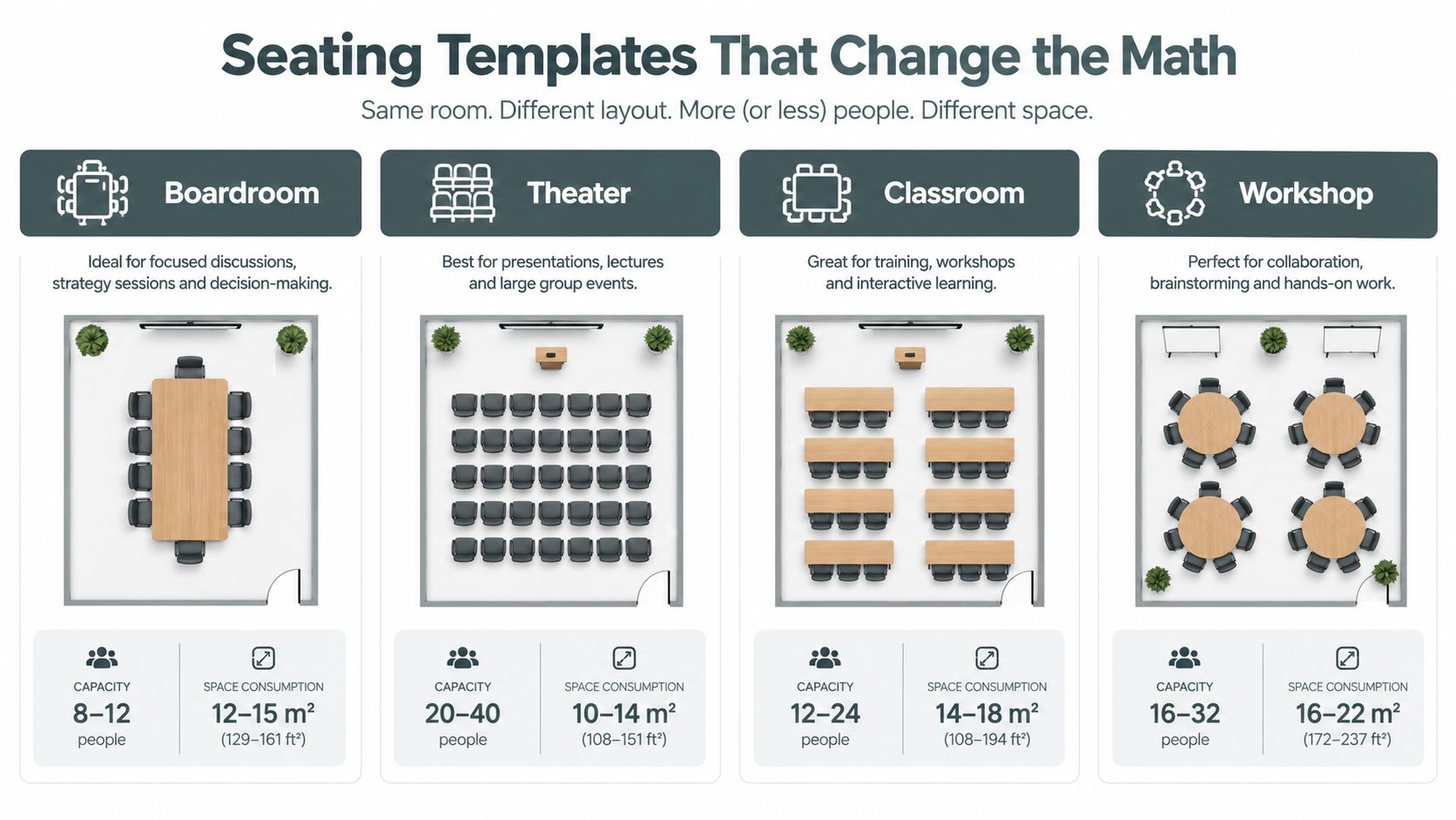
The same room can feel generous or cramped depending on the layout. A boardroom table supports direct conversation but consumes a central block of floor area. Theater seating uses space efficiently for viewing, but it gives attendees limited room to work or move. Classroom rows support presentation and note-taking, while workshop arrangements reserve area for activity rather than maximum density.
Four layouts, four different priorities
Boardroom. A boardroom arrangement places participants around one table, making discussion and shared focus straightforward. It needs a clear perimeter for chair pull-out, service access, and a display or camera zone. The layout works well for executive conversations and decision-making, but the table can create unusable corners in a room that isn't proportioned for it.
Theater. Theater seating points every chair toward a presenter or screen. It can accommodate a larger audience in a limited footprint, but it doesn't support laptops, breakout work, or frequent movement particularly well. The layout should be reserved for presentations and events where orientation matters more than table collaboration.
Classroom. Classroom seating combines tables with forward-facing rows. It gives people a work surface while preserving a presentation direction, but the rear clearance behind chairs is easy to underestimate. It suits training and structured instruction better than open discussion.
Workshop. Workshop layouts use smaller tables, open areas, or movable furniture to support materials, group work, and changing activity. They consume more usable floor area per participant, yet they often produce a better result when people need to stand, write, rearrange, or move between stations.
Template | Space Efficiency | Best For | Typical Clearance Need |
|---|---|---|---|
Boardroom | Moderate, with a large central furniture footprint | Executive meetings and focused discussion | Perimeter clearance around all occupied chairs |
Theater | High for seated viewing | Presentations and private events | Aisles and unobstructed egress routes |
Classroom | Moderate, with forward-facing rows | Training and structured sessions | Space behind chairs and between table rows |
Workshop | Lower density, higher activity area | Brainstorming, making, and team exercises | Wide movement paths between tables and activity zones |
The table shape changes the result as much as the number of seats. A rectangular table can use a narrow room efficiently, while a round table encourages equal participation but may leave awkward residual space along the walls. Modular furniture can help a multipurpose room switch between formats, provided the stored pieces don't consume the circulation path.
Match the template to the dominant meeting
A common failure is designing for the occasional maximum event and making every ordinary meeting live with that compromise. If most gatherings involve discussion around a table, a permanent theater setup will feel impersonal and inefficient. If the room hosts presentations, workshops, and offsites, fixed boardroom furniture will make every transition harder.
Review meeting room layout options before choosing furniture. The practical question isn't which layout looks most polished. It's which arrangement lets the room perform its most frequent job while changing quickly enough for its secondary uses.
A layout change can sometimes free space without expanding the room. Removing a seat, rotating a table, or using movable chairs may create a clear camera view, a wider approach, or a standing zone. That can be more valuable than squeezing another person into the plan.
The Hidden Space Costs Technology and Code Add
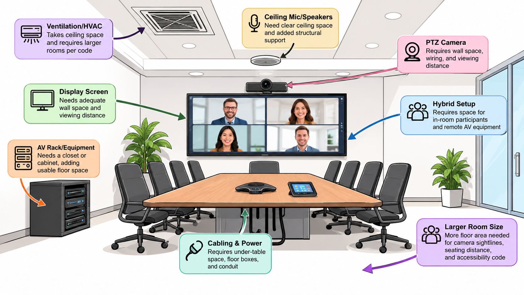
A meeting room may fit its planned number of chairs and still fail during a real hybrid call. The camera may sit too close to the group, the display may force awkward sightlines, microphones may miss quieter speakers, and the only clear route to the door may run through occupied seats. Seating capacity is only one part of the room envelope. Equipment, access, circulation, and code requirements claim space too.
Hybrid rooms need a larger envelope
Current planning guidance places basic seated rooms at roughly 1.8 to 2.4 square meters per person, while hybrid setups often require about 2.4 to 3.0 square meters per person. Coohom's guide to modern meeting room dimensions connects the difference to cameras, larger displays, writing surfaces, and the circulation needed around them.
That extra area supports actual operation rather than decoration. A camera needs a useful position with enough distance to frame the group. A display needs a clear viewing angle and sufficient separation from the nearest chairs. Participants should see colleagues in the room and remote attendees without turning toward a wall or producing a call full of side profiles.
Plan the technology as separate working zones:
Display wall: Keep a clear visual field for the main screen, whiteboard, or shared content. A tall chair, cabinet, or table edge should not block the lower part of the display.
Camera zone: Position the camera so it frames the group without pushing the table against a wall. Test the view from both seated and standing positions.
Service path: Keep power, controls, network equipment, and display connections accessible. A technician should not have to move furniture to reach a cable or replace a device.
Participant zone: Preserve usable table surface and legroom for laptops, notes, and personal devices. A technically equipped room still fails if every seat becomes a narrow strip of worktop.
Conference room technology planning guidance can help with equipment selection, but the facilities decision comes first. A compact all-in-one unit may keep a small room clear. A larger room with multiple cameras, displays, or microphones requires deliberate placement, cable routes, and service access.
Accessibility, lighting, and acoustics occupy real space
Clearance around furniture determines whether people can enter, leave, and use the room comfortably. One planning recommendation calls for at least 36 inches around tables, with 42 to 48 inches preferred on approach sides for wheelchair turning and service access. Coohom's meeting room dimensions guide also identifies a minimum 3-foot walkway behind seated chairs.
Check those clearances against the installed table legs, door swing, wall conditions, and approach route. A nominally wide aisle can vanish when chairs are occupied, a bag is placed beside the table, or a participant needs to turn into the room. Draw the occupied condition, not just the empty floor plan.
Lighting and ceiling height affect the room's usable capacity as well. Glare can make a display difficult to read, uneven light can hurt camera exposure, and hard surfaces can turn ordinary conversation into echo. Ceiling volume, acoustic treatment, and fixture placement should be considered with the technology layout, rather than after furniture and screens have been fixed.
Fire and egress requirements still control the plan, even in a room used casually. Keep storage, loose equipment, and decorative furniture out of the exit route. For a final project, review the applicable building and accessibility requirements with the responsible design professional or authority having jurisdiction.
The practical conclusion is direct: systems around the people become part of the room size, whether the floor plan shows them or not. A room should be sized from observed use, technology footprint, and clear circulation together, not from a chair count alone.
Real Rooms at Freeform House and What They Show
Freeform House offers a useful local example because its meeting spaces aren't treated as interchangeable boxes. The Hall of Fame Room, Freeform Room, Executive Room, and Thomas Room support different meeting behaviors inside a restored 1920 building designed for collaboration.
The Hall of Fame Room is suited to a larger event format, where theater or mixed seating can direct attention toward a presentation while preserving room for gathering. Its planning question is not just how many chairs fit. The team must decide whether attendees need tables, open circulation, a presentation zone, or a transition between formal seating and social interaction.
The Executive Room illustrates the opposite priority. A boardroom arrangement depends on comfortable perimeter clearance, strong sightlines, and a camera position that captures a confidential discussion without making participants crowd the wall. The room should be judged by how naturally a smaller group can work, not by whether the largest possible table can be installed.
Flexible and compact rooms solve different problems
The Freeform Room represents a flexible workshop environment. Its value comes from the ability to change the arrangement for collaborative meetings, exercises, or team offsites. Movable seating and an open activity area matter more here than maximizing a fixed number of places around one table.
The Thomas Room is a compact huddle space for small-team focus. A smaller room can be more effective when it matches the usual group size, keeps setup simple, and avoids the empty perimeter that makes a tiny discussion feel like a formal event.
The public room descriptions don't provide verified square-foot measurements or fixed occupancy figures for each space, so the profiles below describe their planning character without inventing capacity numbers.
Room | Typical Use | Capacity Range | Layout Character |
|---|---|---|---|
Hall of Fame Room | Events, presentations, and mixed gatherings | Larger group, confirmed per setup | Theater or adaptable mixed seating |
Freeform Room | Workshops, collaborative meetings, and offsites | Flexible group, confirmed per setup | Open, reconfigurable workspace |
Executive Room | Confidential executive meetings and strategy | Small to mid-size group, confirmed per setup | Boardroom-oriented with focused sightlines |
Thomas Room | Huddles and concentrated small-team work | Compact team, confirmed per setup | Intimate, efficient, discussion-led |
Specialized spaces don't follow meeting-room formulas
The Rise loft studio and the in-house podcast booth show why a single per-person formula has limits. A production space needs room for cameras, microphones, lighting, backdrops, acoustic treatment, and movement around the subject. Its usable footprint is driven by equipment and shot design rather than chairs around a table.
That distinction matters for local entrepreneurs and small teams choosing a venue. A boardroom is appropriate for a strategic discussion. A workshop room is more suitable for collaborative work. A studio or podcast booth belongs to a different category altogether, even if the same members use it during the same workday.
The planning principle is consistent across all four rooms: confirm the intended arrangement, not just the room name. Freeform House's boutique coworking space overview gives prospective users a starting point, but a serious booking decision should still verify the floor plan, technology, access route, and expected meeting mode.
A Practical Booking and Planning Checklist
A quick room check should take less than ten minutes. Walk the space in the same order that the meeting will use it, from arrival through presentation, discussion, movement, and departure.
Quick scan before booking
Confirm attendance: Use the usual meeting size, not the optimistic maximum.
Check the arrangement: Identify whether the room is boardroom, theater, classroom, workshop, or flexible.
Trace movement: Pull out a chair, walk behind it, reach the door, and approach the display.
Inspect the view: Sit in the farthest seat and check whether the screen and every participant remain visible.
Locate power: Check where laptops charge and whether cables cross a walkway.
Listen: Notice echo, HVAC noise, corridor sound, and whether remote voices will be easy to hear.
Check access: Verify the entrance, turning space, table approach, and route to the restroom or exit.
Test the technology: Confirm the camera frame, microphone coverage, display connection, and control method.
Detailed planning pass
For a new room, mark the table footprint and draw the circulation envelope around it. Add the display wall, camera zone, writing surface, service path, door swing, and any fixed columns or radiators before selecting furniture.
Run a short rehearsal with the actual meeting flow. One person presents, another joins remotely, a third writes on the wall, and someone else leaves halfway through. If the room only works when nobody moves, reduce the planned occupancy.
Also test a future scenario. Even if the room isn't currently equipped for video, leave a plausible camera position and remote-participant sightline. Retrofitting a display onto a wall with no viewing distance or placing a camera behind a glare-prone window usually costs more than reserving the zone during planning.
The Utilization Paradox Why Bigger Is Not Better
More meeting-room area doesn't automatically produce better meetings. Planning guidance commonly places healthy utilization around 50% to 75%, depending on room size, and notes that large rooms may run at only 40% to 50% utilization while smaller and mid-size rooms are used more consistently. These figures and the distinction between reservations and actual occupancy appear in Gable's office space planning guidance.
The practical response is a varied room portfolio. One planning guide suggests a mix of small, mid-size, and large rooms, with roughly 60% of floor area for workstations and 40% for meeting, collaboration, and social space. OfficeRnD's coworking planning guidance describes another common split, about 60% workstations, 30% collaboration and amenities, and 10% operations.
The numbers aren't a substitute for utilization data. Compare bookings with check-ins and observed occupancy, then resize the mix around actual demand. Freeform House follows the more useful principle: distinct rooms for distinct meeting modes, rather than one oversized room asked to do everything.
Freeform House provides members with the Hall of Fame Room, Freeform Room, Executive Room, and Thomas Room for meetings, workshops, executive discussions, and focused huddles, plus The Rise loft studio and an in-house podcast booth for content production. Visit Freeform House to review the available spaces and choose a room that matches your attendance, layout, technology, and circulation needs.
Comments